Blink Kids Investing Launch Film

blink dark

Client
Blink – heyblink.com

Year
2025

Role
Creative Director
Design & Animation

Field
Motion design

Blink is an investment app. But that description undersells the idea behind it.
Blink is built around a life cycle. Your parents open an account for you as a kid. You grow up with it. Then one day you open one for your own kids. It’s meant to stay with you for life.

Blinkids is their new feature: savings and investment accounts that parents open for their children. This film was made to launch it.
The goal: make investing for your kids feel simple.

The Problem

Most investment apps look the same. Dense graphs, blinking numbers, screens built for traders. That look doesn’t work when you’re asking a parent to think about their child’s future.

The challenge: make investing for your kids feel simple and warm, not intimidating. And communicate the life cycle idea, that Blink is more than an app, it’s something that follows you through life, in about a minute.

The Approach

I got the project with a script only. No boards, no design, no visual direction.

The first thing I did was edit the script. Before touching a single frame, the story had to be tight. I cut what didn’t serve the launch and sharpened what did.

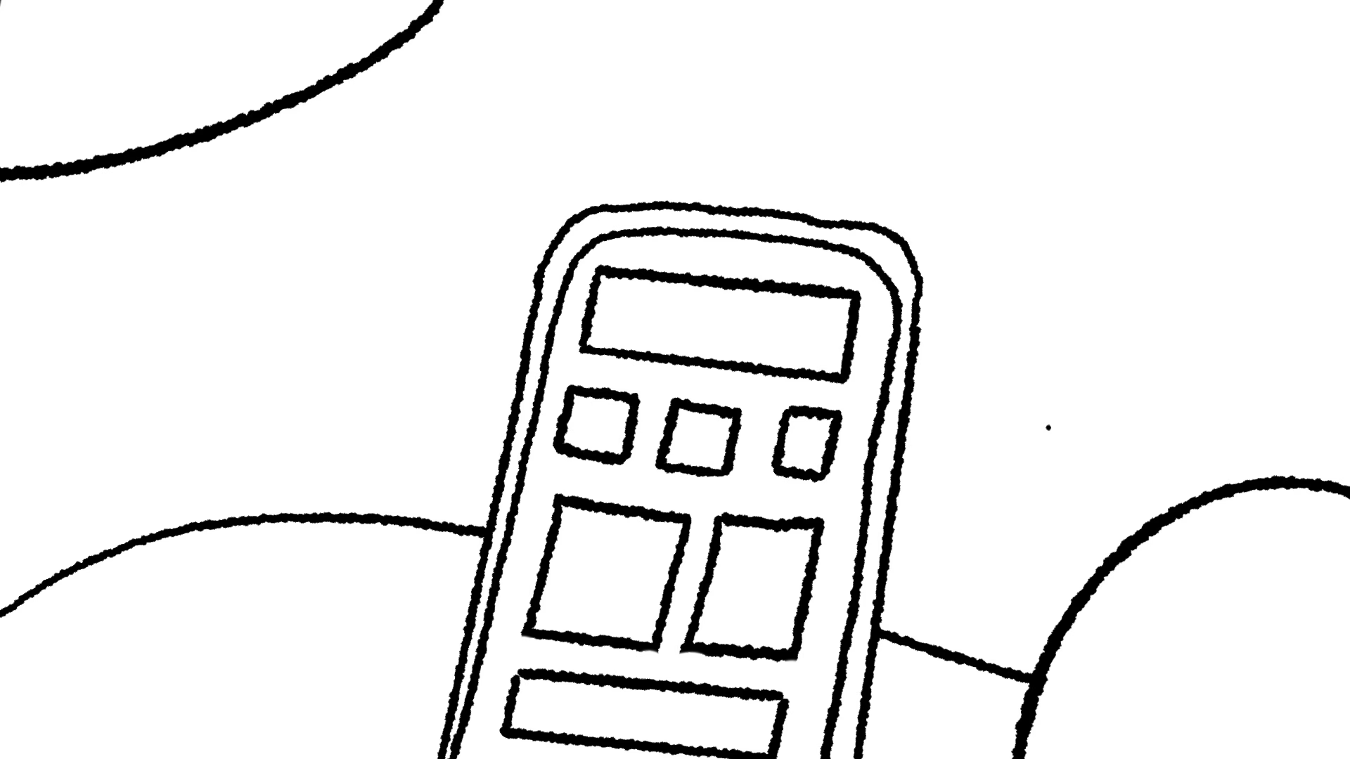
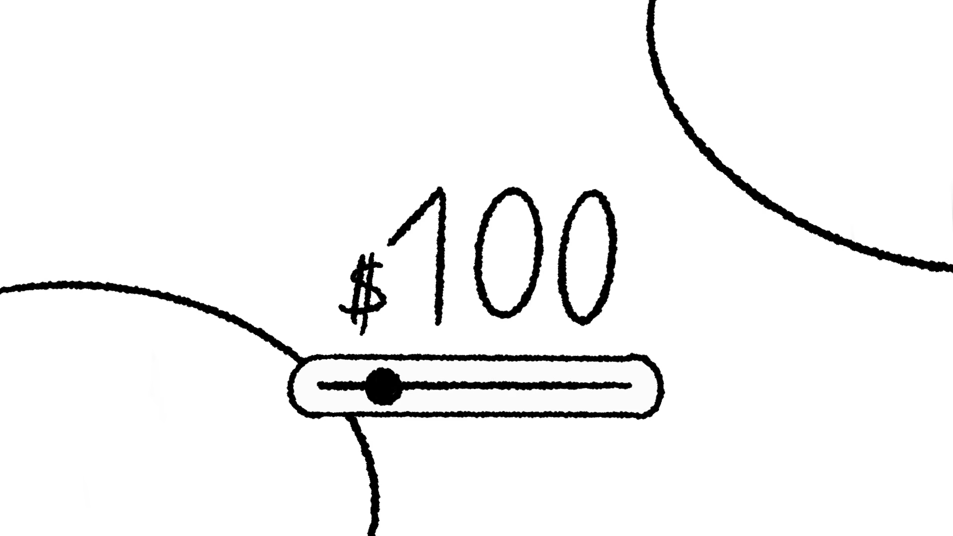
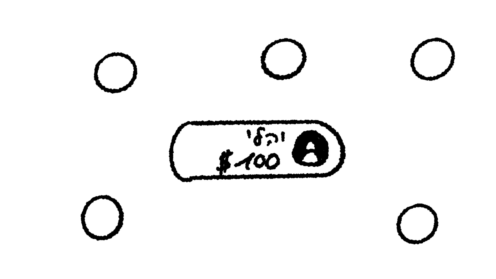
Then came the rough storyboard. This is where the real decisions happen. It’s fast, it’s sketchy, and that’s the point. Shai Lanir, Blink’s Head of Design, and I went back and forth here. Real conversation, real notes, real precision. Changes at this stage cost minutes, not days.

[VISUAL: Storyboard sketches, the 3 pages, side by side or as a horizontal scroll. Caption: “The rough storyboard. This is where everything gets decided.”]

Only after the storyboard was locked did design begin. That’s how I always work. Before the animation starts, the design has to work.

The Design System

The easy choice was to look like every other finance app. Dark UI, glowing graphs, serious tone. We went the other way.

Simple shapes. Bold, warm colors. Yellow, pink, purple, teal, deep navy. Flat illustration with strong shadows. Real photos of real people inside the UI, so the product feels human, not hypothetical.

When the film talks about investing, the visuals show coffee and cookies next to the graph. That was the whole point: investing for your kids should feel as casual as your morning coffee, not like a trading floor.
[VISUAL: 3-4 design stills in a grid. Suggested frames: the yellow account screen, the pink “future view” screen, the coffee mug scene, the three circles transition]

Every screen in the film shows a real moment in the product: opening a plan for your kid, naming it, watching it grow over time. And in key moments, like setting the amount or the deposit date, we simplified the UI even further. Fewer elements, more air. The simplicity isn’t claimed, it’s shown.

Typography carries the story between scenes, big and confident, never crowded.

The result is a film about money that doesn’t feel like a film about money. It feels like a film about family.

Client Feedback

Came out amazing!

Hey Guy, it came out stunning!

Credits:
Creative Direction, Design & Animation: Guy Nativ

Sound Design: Tal Avital

Voiceover Recording: Guy Shkedy

Blink Team:
Head of Design & Creative Director: Shai Lanir

Voiceover: Adi Barzani

This website uses cookies to provide the smoothest possible user experience. Without these cookies, the website will not function properly, and your experience of our website will be diminished. Please accept cookies to continue browsing.